IS YOUR WEBSITE WORKING FOR YOU?
As a small business owner, your website can and should be more than just a landing page for your right people. A well-designed website acts as an honored team member that works for you 24/7—converting your audience from fans to clients/customers 😀
In order to make this happen, and create your 24/7 amazing employee website, you need to start with a little review…

Check in on your business goals.
First, it’s important to understand your ideal person and how you can help them. This may seem pretty basic, but attracting your dream client or customer doesn’t have to be complex. In fact, your website should flow with ease and with very little confusion on how that person can work with you, collaborate, and/or buy from you.
This is your foundation for your website. If you’re not 100% sure or if you’re feeling the need to update, it’s time to start brainstorming. Establish 1–2 main business goals that will generate revenue and 1–2 secondary goals on how you will nurture your audience (blog/newsletter/videos).
For example: my main website goal is to have ideal clients book a call about larger branding and web design projects. My secondary website goals are to engage with my blog and sign up for Building A Purpose-Driven Brand mini course.
Make it clear what you do.
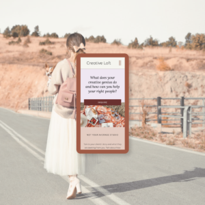
This may seem obvious, but you’d be surprised how many of us forget to spell it out to potential clients/customers. Having a clear statement on what you do and who it’s for (on your homepage and above the fold/closer to the top) will keep people around because they understand why they’re there in the first place. This statement can of course be infused with your brand personality (and should be!) but make sure it’s clear and not overly fluffy. If people feel a sense of confusion within the first couple of seconds, they’ll most likely head elsewhere.
For example: on my homepage, it states what I do and who it’s for (Intuitive branding, web design, and illustration for brands that inspire a better future). Right after that, I have a button that says “Let’s Begin” Anyone who’s new to OWS will have a great starting point to learn more. This is also the start of my sales funnel (more about that right below).
Make it easy for your clients to work with you!
Make sure you’re guiding your clients throughout your website in the form of a sales funnel. A sales funnel is simply the path from landing on your website (usually homepage) to becoming a paid client/customer. Having an easy to navigate menu is important, but it shouldn’t be the only way to move around on your website. Make sure there’s a clear outline from your landing page (usually homepage) to where they should click next. In this funnel, it’s best to guide and nurture your right person. They need to get to know you first, feel seen through identifying their struggles, and understand your offerings/how you can help. What’s going to make your website convert is by having a clear next step that guides them to your call to action.

Design and write with your audience in mind.
This one goes back to branding, and if your branding isn’t working for you, you may want to rewind and start there first. Having a clear aesthetic and brand voice will make a huge difference when the right person comes along to check out your website.
A few things you can review:
• Your overall use of language in your copy. Does the language you use resonate with your right people? Is it language they use themselves?
• Your color scheme. When you first land on your website, how do you first feel? Do your colors give off the feeling you’re looking for? For example: whites are light, clean and ethereal, blues are calming and trustworthy, reds are bold and, honestly, makes us hungry… which is why you’ll see a lot of food brands with the color red 😂
• Your typography. Are the fonts you’re using speak to your right people? Are your right people looking for high-end and you’re using a more rustic font?
• Brand photography. Normally it’s best to invest in a professional shoot, and have at least one photo of you that’s not just on your About page. This one’s pretty important… people buy from other people and having a photo of you more front and center will gain that feeling of trust. If you’re feeling stuck with your current photography, I have a great blog post all about prepping for your first shoot How to Have an Amazing Brand Photoshoot.
Keep in mind who you want to work with/sell to… Quick Starts, Fact Finders or both.
Remember a few emails ago when I talked about finding clarity through personality tests? Well understanding different personalities and how different people operate is key to converting your right type of people! You want to make sure your sales funnel and specific sales pages accommodate one or the other… or both!
For example: you have a sales page for a new course that you’re offering and you’d like to accommodate both Quick Starts and Fact Finders. To accommodate the Quick Starts, you’ll need to make sure you have a call to action link/button near the top of the page. Quick Starts want to take action pretty quickly, and they don’t want to be stuck having to scroll all the way to the bottom to take action. To accommodate Fact Finders, you’ll need to have all of your necessary info on that sales page. Fact Finders want to know all of the things before they take action. For them more tends to be better. That all being said, still keep your info clear and concise, adding fluff will lead to overwhelm, friends!
Your Website always evolves.
Even when you invest in a custom website, your foundation is set, but there will always be things to update and tweak over time. Doing a website audit at least twice a year will help keep your brand aligned with your vision. If you haven’t checked in on your website in a while, it may be time to do a little review!
Learn how to...
build a thriving brand that aligns with YOU
Start Here
set your foundation
set your foundation
Free Mini Course!
©2024 Onward Wander Studio LLC, All Rights Reserved | lauren@ow-studio.com
