BRANDING BASICS | THE LOGO FAMILY
Welcome to OWS’s new series… Branding Basics! A monthly series going over the basics of a strong brand that connects.
Branding, in general, tends to feel like a vague term for even the most established business owners out there. For many of us, when we hear the term branding, we immediately think “logo,” and of course, that’s a part of branding, but only a small part.
Branding is ultimately what others say about your business when you’re not in the room. It’s that gut feeling and emotion that creates a connection with your audience. The visual elements of your branding, your logo, typography, and colors, are actually considered your brand identity.
You create magic when you cultivate a strong brand identity that resonates with your branding as a whole. All elements of your branding have to be in tune with your messaging, values, voice, and visuals to really connect with your right people. I hope to help you better cultivate a brand that lasts by going over these branding basics 🙂
For today, we are going over the complete logo family that helps craft a cohesive brand identity that results in better branding. Woo!
The Logo Family
Meet the logo family. Every logo needs some support and that’s where the logo family comes in. No more one lonely logo that lives for the entirety of your brand identity. Each member of the logo family takes part in creating a consistent and versatile brand.
Here’s one instance of why the logo family is important to have…
You have a sustainable skincare brand and you would like to add your branding to the back of your packaging in a smaller space. Using your main (primary) logo to do the job may simply look awkward, unpolished, and/or illegible. Doing this will lose your credibility as a sustainable skincare brand. The feeling of trust will diminish.
It may sound silly… but have you ever came across packaging or a website that’s awkward, hard to read, or simply outdated? How did you feel about purchasing from that brand?
Having a complete logo family to use throughout your brand visuals is key to a brand that lasts. Below is a breakdown of the beloved logo family.
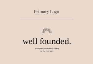
Primary Logo
This is your main logo and usually the largest and most complex version of your logo. Your primary logo sets the tone for the rest of your logo family. Depending on your branding, this logo can still come across as minimal or simple, but it will always be the most elaborate version within your logo family.
This one will normally have a brand descriptor or tagline. It can also have items like brand established date and/or location. That all being said, when it comes to logo design, less is more. Add these elements if it aligns with your brand, but make sure to keep it less cluttered so it’s more “digestible” for your audience.
Great for…
Places that allow for a larger format for your branding and plenty of surrounding whitespace, top of your website, front of your packaging design, front of business cards, shop signage, etc.
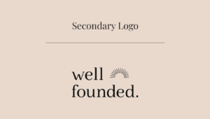
Secondary Logo
As the name says it, this is your second most prominent logo next to the primary logo. This one is usually still robust but simpler than the primary logo. This version will still look pretty similar, to your primary logo, but the type may be stacked or oriented to the left instead of the center. For certain brands, the secondary logo may be used the most as it’s a happy medium between robust and simple, which can be used in a more versatile way.
Great for…
Space that allows a slightly larger format for your branding, your website header, collateral, and business cards.
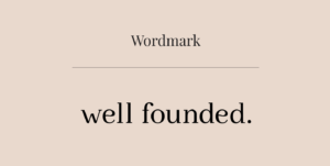
Wordmark
Depending on your brand design, your wordmark may also act as your secondary logo or even your primary logo. Simply put, your wordmark is the type only version of your logo. So no visuals or logomarks (icons), but only the typography. Some brands choose not to include a logomark in their branding but keep it classic with simple type.
The wordmark can also be referred to as the type only section of your logo. Let’s say a visual is placed above the business name. Take out that visual and what’s left is just the typed out name. That’s considered the wordmark.
Great for…
Similar spaces as your secondary logo, your website header, collateral, business cards, and space that normally allows a more horizontal format for your branding.
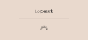
Logomark
In opposition to the wordmark, the logomark contains only the visual element of your logo. It can also be considered the main icon for your branding overall. (Think Nike swoosh here.) Your logomark can stand on its own or be paired within your primary and/or secondary logo.
Great for…
Your website footer, as a supportive element on your homepage, front or back of packaging, and in spaces that are more limited for your brand identity.
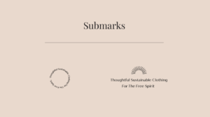
Submark
Your submark is the simplest form of your branding. This can consist of simple imagery, iconography, shortened type, circular type, etc. Truly anything that can be an aligned representation of your brand identity in a much smaller form.
Great for…
Your website footer, back of packaging, smaller spaces within collateral, and space that has limited space or is placed in a less prominent format for your brand identity.
Monogram
Your monogram is a type of submark, where you showcase just the initials of your brand name. Depending on your brand, this can be done simply or creatively. Neither one is better than the other. Making sure your brand identity aligns overall is what’s important here!
Great for…
Your website footer, back of packaging, smaller spaces within collateral, and space that has limited space or is placed in a less prominent format for your brand identity.

So there you have it! The beloved logo family.
Depending on your brand, you’ll utilize at least three of these elements: your primary logo, your secondary logo, and at least one form of submark. However, as your brand grows, you’ll realize that you may need more variations than these simple three.
Having a complete logo family helps your brand identity remain versatile and strong but not awkward and redundant. Cramming your primary logo in a space that’s tough to read is going to subconsciously lose credibility with your ideal audience…. and no one wants that! Adding versatility to your brand identity will do the opposite and subconsciously add trust and value within your ideal audience’s eyes.
Feeling stuck within your own brand identity and looking for some serious transformation? I’d love to hear from you! Book a call today and let’s chat.
See you at the next Branding Basics lesson!
Learn how to...
build a thriving brand that aligns with YOU
Start Here
set your foundation
set your foundation
Free Mini Course!
©2024 Onward Wander Studio LLC, All Rights Reserved | lauren@ow-studio.com